The Process
User-centered design
Understand context of use
I started with the first step of the User-centered design process, Understand. I chose this design process because each phase focuses on users and their needs. I did a competitive analysis of competitor products — SoundCloud, Spotify, and Beatstars. I noticed that these sites featured sidebar navigation menus, clean designs, and concise microcopy. Features like these make the competitor sites more visually appealing and user friendly.
I also researched Soundclick reviews to get a sense of the pain points users are experiencing. Customer reviews confirmed that the site’s design feels outdated.
“This site won’t “wow” you. It doesn’t have a very sleek interface and it’s a bit hard to navigate sometimes”
“stale interface”
“I wish their layout was a lil cooler though. It looks crappy and boring at first eyesight.”
I also launched a website evaluation study using UserTesting’s human insight platform to gain understanding of user needs and their current experience of the Soundclick site.
Specify User Needs
After viewing video recordings of users navigating the Soundclick site, I learned that the site was unclear on its purpose. I also learned that users appreciate the site’s simplicity of design, affordable price point and the longevity of the company. Another major pain point was the lack of information about the intended audience and objective of the site. Some questions that arose during the test included:
What’s the main goal of the site?
What is the site for?
Are people paying for the song or the background track?
Do people have to pay royalties?
How can I learn more about legality and copyright?
Is it free?
How are artists protected?
Other comments made were in regards to the, “outdated early 2000’s feel” of the site and how, “nothing about the design would make me come back… not visually interesting”. Insights also revealed navigation issues such as unclear language in the menu bar.
Design solutions
Once the needs of the users were specified, I started thinking of solutions to address those needs. I began with designing a new brand logo and fonts for Soundclick. The goal was to make the site feel more modern and visually attractive. I focused on these three areas: Design, Information and Navigation.
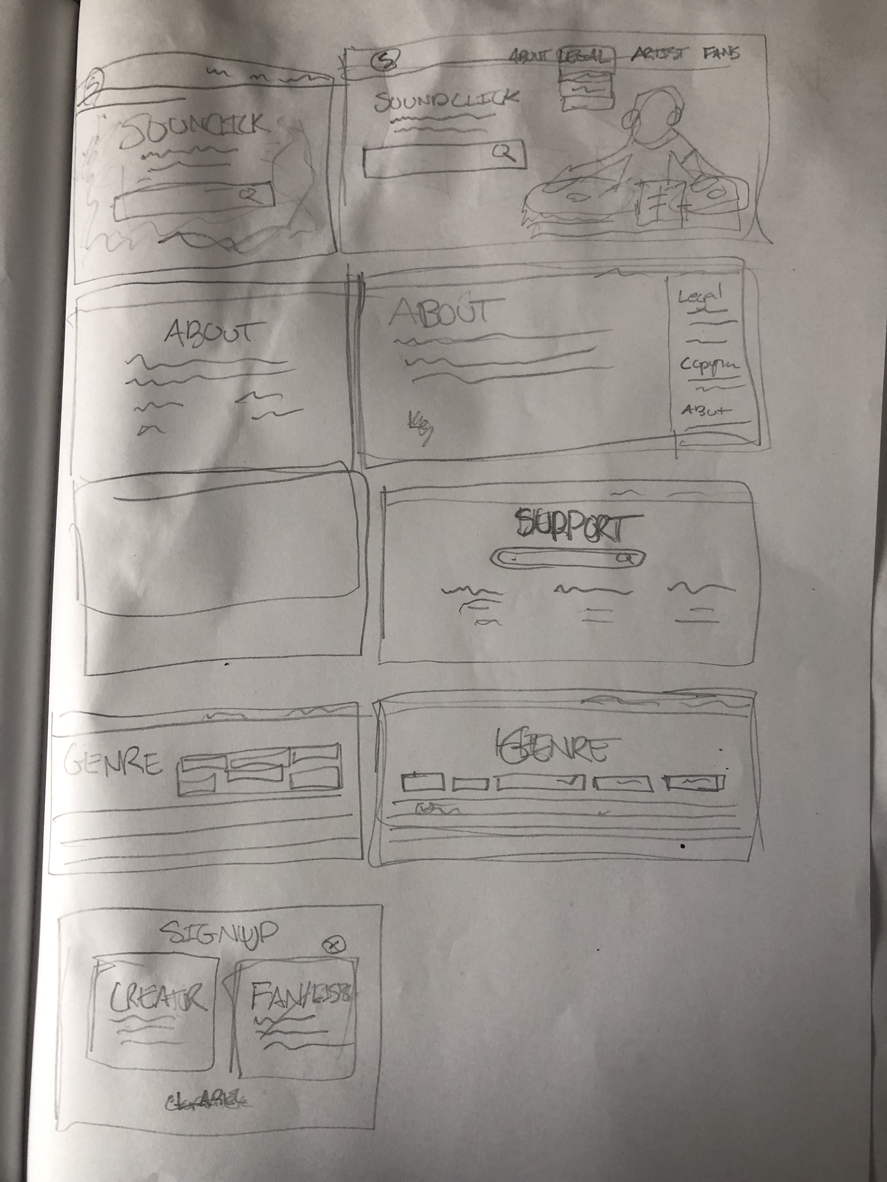
With an outline of ideas, the next step was to implement them. I started out by making low fidelity wireframes using pencil and paper, then later using Figma. After solidifying the flow of the site, I went through each page and added text to give users more information about Soundclick as well as bright colors and graphics to make the site more visually appealing. From there, I started to link each page together creating a prototype that users could seamlessly navigate when providing feedback.
Evaluate against requirements
Once the prototype was complete, I returned to UserTesting to run a visual design comparison test to compare how the prototype I designed compared to the current site. Users were shown the current Soundclick site first and then shown the prototype I designed afterward. During each test, users were prompted with the following action items:Describe what this site is communicating.Rate your emotional reaction to this content.Do you find the page to be attractive?Does the content have a clean and simple presentation?Describe the difference between the two options you just saw.The feedback I received revealed that the initial landing page I designed was still not effective in addressing user needs. Testers stated “I don’t know what it’s communicating… It doesn’t tell me it’s a streaming site.” It seemed that the first iteration of the landing page was too similar to the current site. The major difference was the updated navigation bar and the added tagline/subheading below the Soundclick logo. Unfortunately, the tagline/subheading still did not provide users enough information on the purpose or function of the site.
Iteration
In order to address this issue, the landing page needed to specifically spell out who the site is for and why it exists. Therefore, I decided to take inspiration from a competitor site, Soundcloud. On Soundcloud’s landing page, there are two images on a carousel: one for listeners and one for creators. The image for listeners has a tagline that references discovering music on their site. Whereas the image for creators references the ability to upload tracks and highlights the uniqueness of the artist’s journey.
I decided to mimic this design element in my own landing page for Soundclick. I created two sections of the landing page: one for creators and one for listeners. Each section with a subheading detailing its function. I added a bright green color to the creator section in order to provide contrast between the sections. I also added simple shapes in each section to make the site feel fun and creative. I also added back the genres that are on the current landing page because feedback revealed that this was a context clue to understanding that Soundclick is a music platform. Lastly, I made some small changes to simplify the design of the navigation bar. One user mentioned how the lines on the Browse and Category pages were overwhelming and complicated and how they preferred the simplistic design of the current site. I addressed this by incorporating a dark color theme, making the separation of content less straining and overwhelming to the eye.Home Page and Categories pages from second iteration.
Once these changes were complete, I went back to UserTesting with my updated prototype to evaluate if these changes addressed user needs. Users mentioned that the prototype was more specific, modern and favorable in comparison to the current site. They also mentioned that the filter selection I added on the category page communicates to users that Soundclick is invested in a user-friendly experience. I also received feedback that the prototype allows users to easily find music as opposed to the current website. After this second iteration, when users were asked What option did you prefer? all of the users selected my prototype over the current website.
Outcomes & Lessons Learned
All of this feedback confirmed that the solutions I implemented addressed the user needs discovered in the research phase of this process. By adding specific sections on the landing page for creators and listeners and an About page that details the company’s history, mission statement and team members, I was able to answer, what’s the main goal of the site? What is the site for?. Creating a support center helped address concerns over legalities including royalties and copyright. Adding filter options, such as copyright and beats per minute, provided users with an easy way to sort between songs or find music that can be used for production instrumentals or film compositions.
For this project I was able to use UserTesting’s platform, which provided me with testers that met my specific demographic criteria. This helped me create adjustments that were tailored to the needs of potential users of this platform.
I learned how to balance what users appreciated about an existing design with new and improved aspects that meet the user’s needs. For instance, I learned that while users enjoyed Soundclick’s dark color scheme and genre categories on the landing page, they disliked the placement of the search bar and menu button since they added little value.
Another major lesson came from iteration. Receiving feedback on more than one prototype allowed me to revisit and make important adjustments to satisfy users.